HOOT.AE · 2022
Turning around the UAE’s first cooperative marketplace.
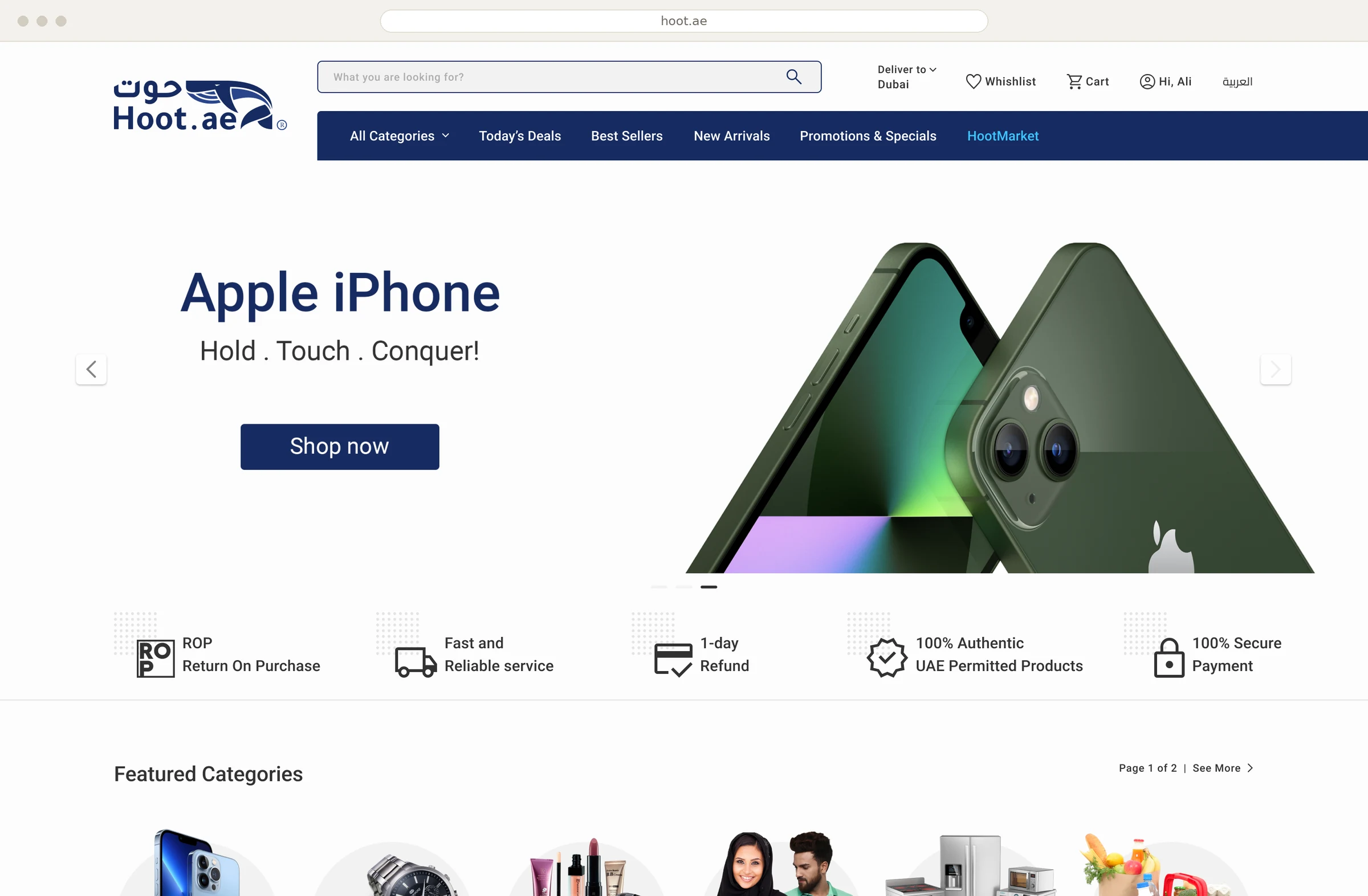
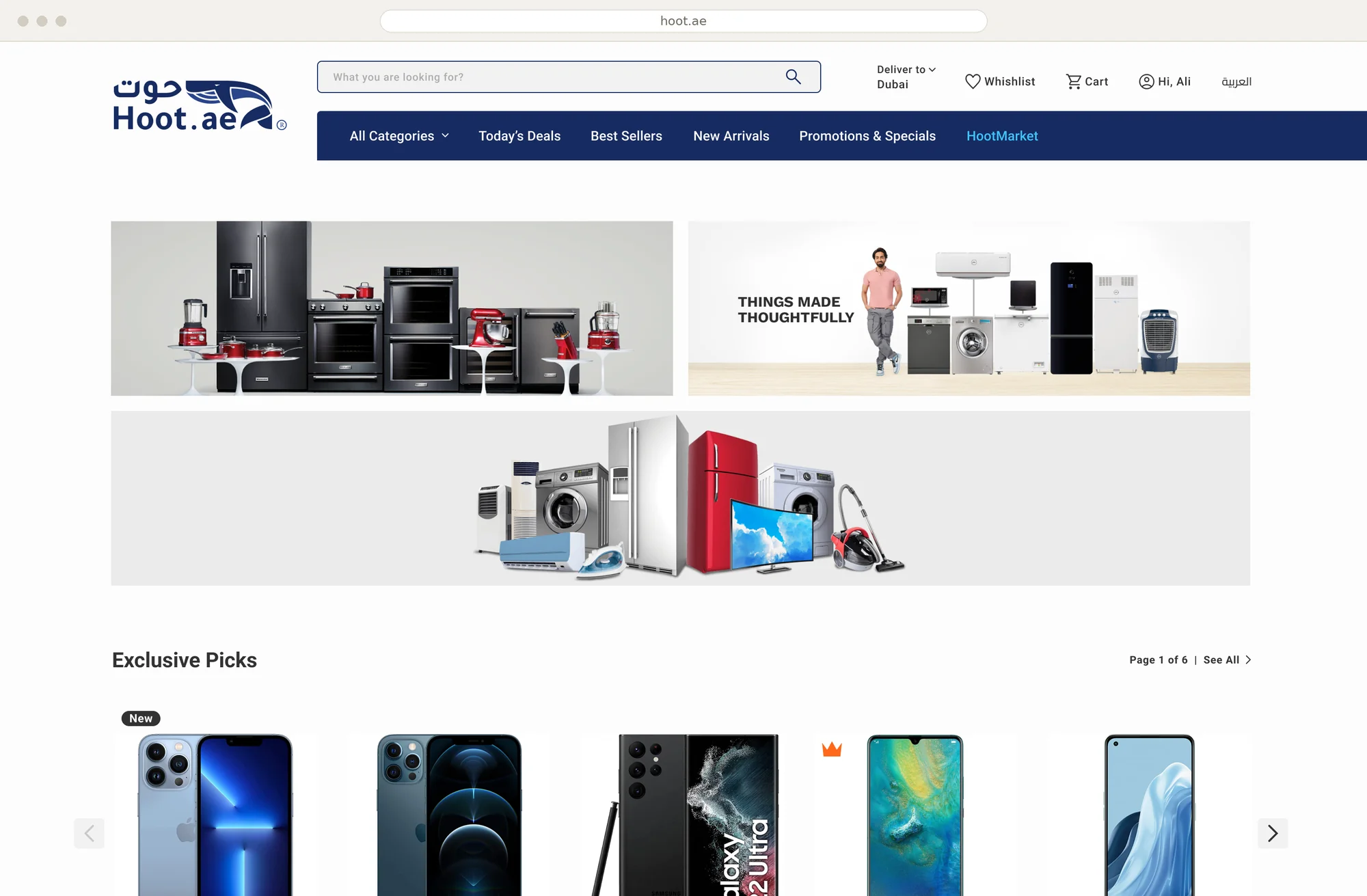
Hoot.ae is a multi-vendor platform for ADCC members and UAE residents.
20+
critical UX gaps resolved
65%
more team productivity
85%
less documentation time
01
From breakdown to breakthrough
The problem
The Hoot.ae platform was in crisis, what my manager described as a “free fall.” User retention was dropping rapidly, and the entire experience was breaking down. The challenges were widespread, spanning marketing, packaging, delivery, website performance, and significant UI/UX issues.
The goal
My primary objective was to identify the core UI/UX issues and rapidly design a new concept for the platform, despite tight timelines and limited resources.

02
Research
I planned to start the design thinking process by understanding users, but since the cooperative had already defined them and I lacked context on why users were dropping off, I focused on improving the digital experience, excluding technical issues.
UI inconsistency was evident, but not enough to explain the decline. Given it’s an e-commerce platform, I began primary research with a Net Promoter Score (NPS) survey, customized using Harvard Business School insights. To keep it natural, I framed it as a general user habits survey.
However, the results didn’t reflect real issues. Further research showed that NPS may miss specific pain points, so I switched to Customer Satisfaction (CSAT) surveys, which revealed the true reasons for user drop-offs and helped me move forward with the design process effectively.
A key resource was Assortment and Merchandising Strategy by Constant Berkhout, which guided my thinking on product placement, shopper behavior, and creating seamless user journeys across different scenarios.

Six of ten steps scored 3 or less.
Customer satisfaction for every step of buying on Hoot.ae, out of 10. Each stitch is one point. The red rows are where the journey was breaking.
Customer Satisfaction (CSAT) survey, 2022.
Seven of ten people would not recommend it.
The Net Promoter Score survey, one stitch per answer.
- 7 detractors
- 2 passives
- 1 promoter
10% promoters − 70% detractors = −60 NPS
The thread drops at sign-in, and again at the address.
How a customer felt at each step of buying a pair of earphones, from opening the home page to the confirmation.
1. Home page
Users had no technical issues navigating the homepage. Their main feedback focused on how the products were merchandised.
2. Searching
Users found the search bar frustrating and unintuitive: there were no suggestions, no search icon, and results showed raw backend indexing terms. Pressing Enter was the only way to search.
3. View product
Some products lacked images, leaving users to click on empty spaces with no context. There was no additional product info, no related items, and no suggestions, creating a dead end in the user journey.
4. Compare products
Comparing products was frustrating for users due to the lack of clear information and standardized attributes.
5. Add to cart
The Add to Cart interaction felt awkward, feedback was unclear, and the animation lacked clarity. Stock limits were also confusing, with no clear criteria shown to users.
6. Checkout
The checkout experience was frustrating: poor layout, no back button, and unclear steps left users confused and uneasy, especially about the security of the payment process.
03
Ideation
Since this is an e-commerce platform, I followed the famous Jakob’s Law: users spend most of their time on other websites, so our users need to feel the same familiarity they know from other e-commerce platforms. In other words, we weren’t going to reinvent the wheel.
I spent most of my time on the ideation stage, and since we were going for a full prototype, I used both How Might We and Crazy Eights exercises to stimulate ideas.
For the merchandising, I used criteria from Berkhout’s book, shown in the image below. The book also mentions the rule of 7, or as we UXers know it, Miller’s Law. The rest of the ideation shows in the final design for the first iteration.
Every kind of product has a best place on the shelf.
The merchandising matrix behind the catalogue structure, drawn as a shelf of five levels and five positions. Black marks the best place for a kind of product, red the place to avoid.
04
Iteration
Given the tight timeline, I moved straight into the first iteration after completing my research. We chose to build and test a full hi-fi prototype instead of starting with a lo-fi one.
I applied insights from my research alongside key design principles like Jakob’s Law and Hick’s Law to guide the design decisions.
The redesigned experience and restructured workflow lifted team productivity by 65%, resolved 20+ critical UX gaps identified in research, and cut documentation time for stakeholder reviews by 85%.